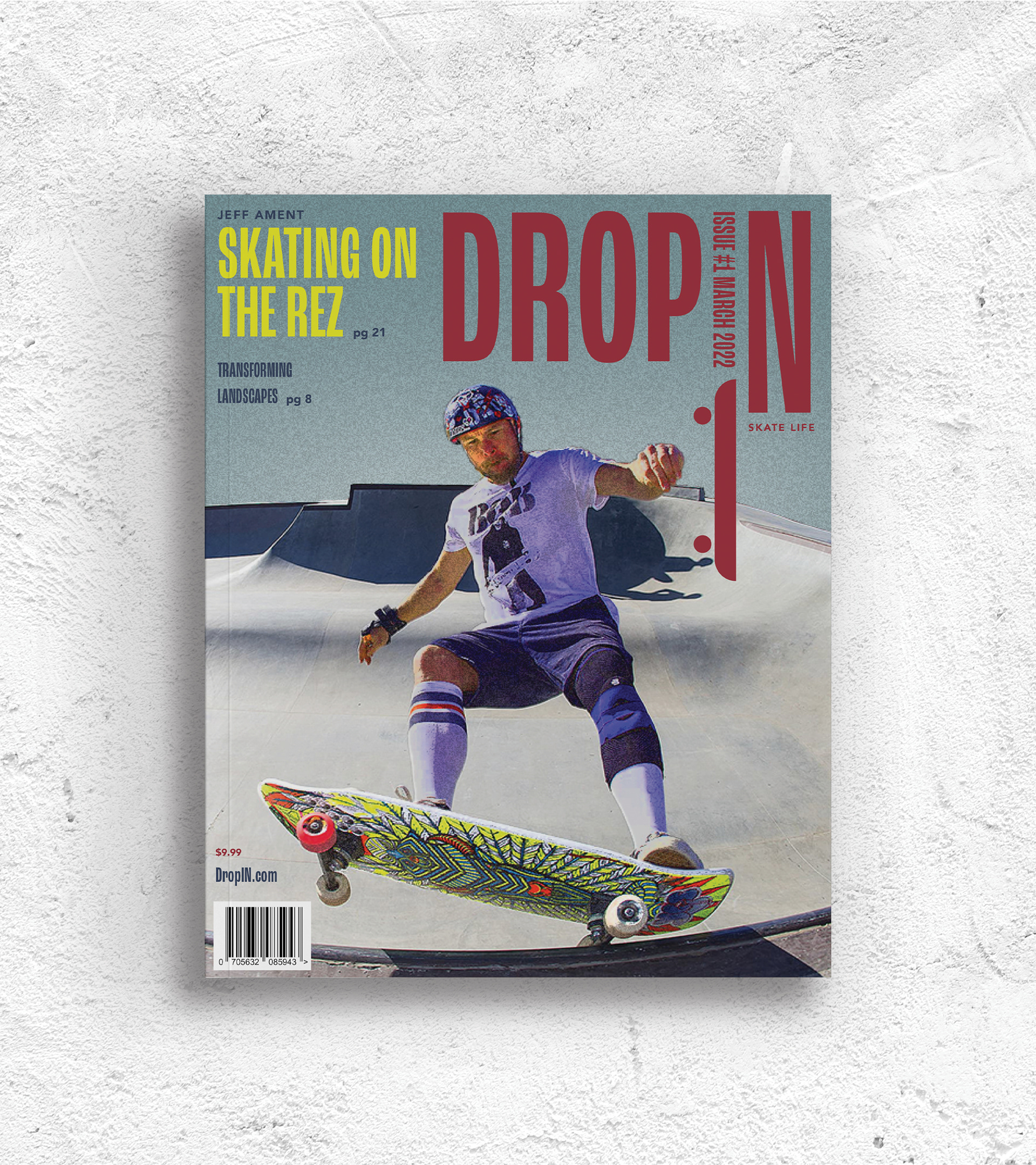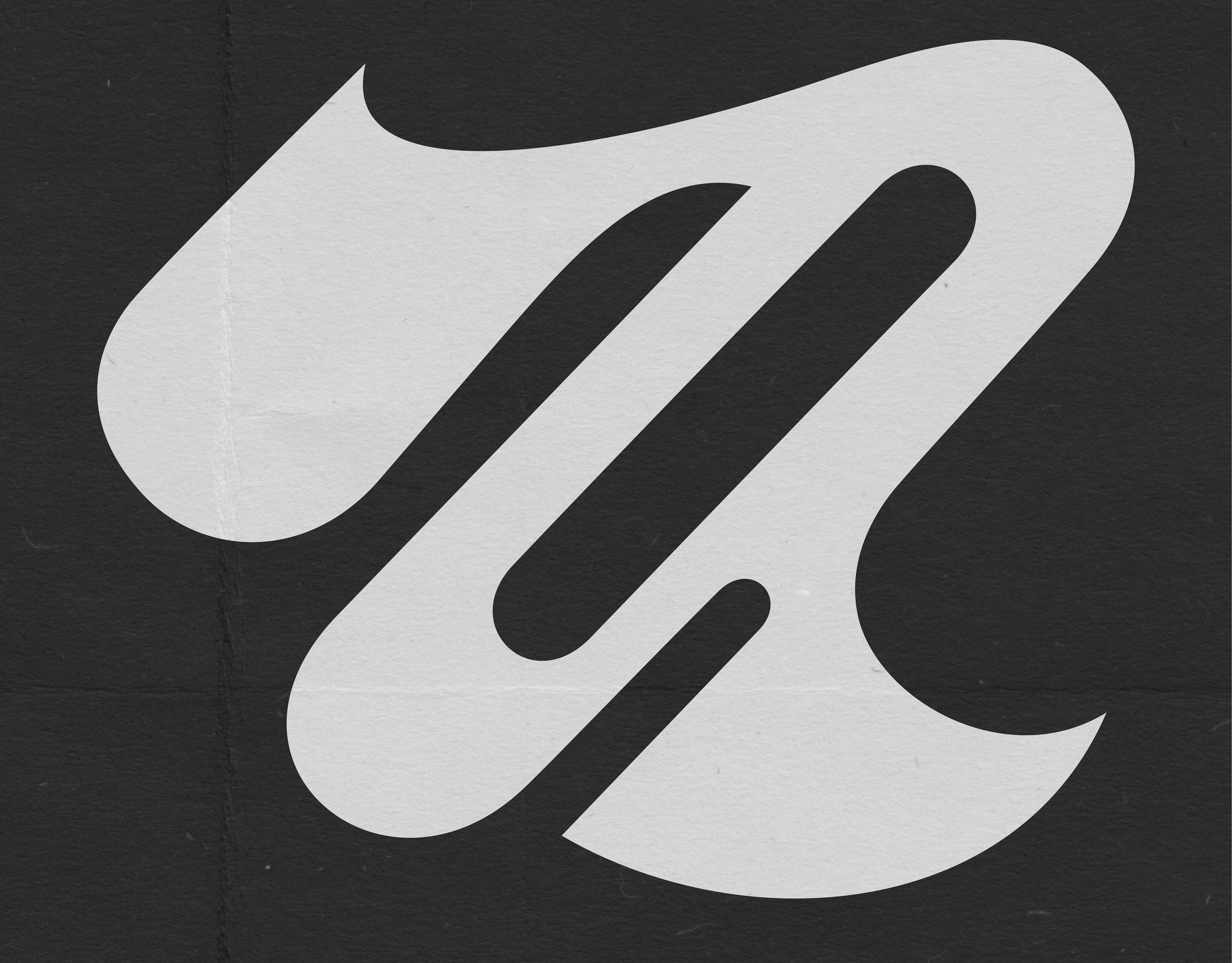
The skateboarding magazine "DROP IN" draws its name from the term used by skaters when they enter a ramp or bowl from the top. The headlines and titles feature bold drop caps that catch the reader's eye and create a strong visual impact. The use of grainy images with a vintage feel is a nod to the raw and gritty nature of skateboarding culture. The design also incorporates layering, which seamlessly blends images with type and adds depth and dimension to the pages. Overall, the design captures the essence of the skateboarding world and invites readers to drop in and explore.
ART DIRECTION: NATHAN YOUNG