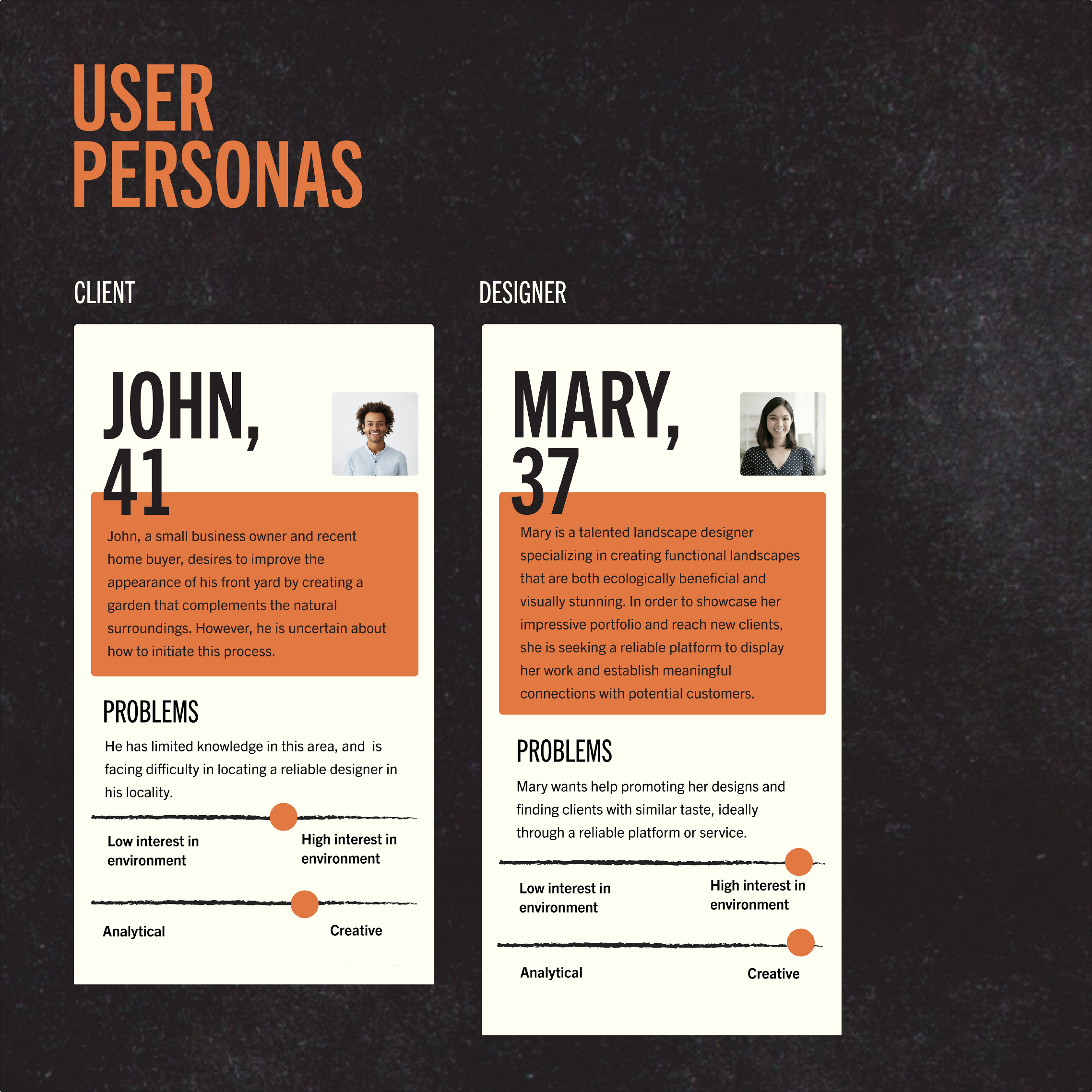
Miscommunication between clients and landscape designers can often lead to frustration during the design process or dissatisfaction with the outcome. Equilibrium is an app designed to bridge this gap in communication, resulting in a better outcome for both parties. By promoting the benefits of enhancing the natural environment and highlighting the importance of achieving this through good landscape design, Equilibrium helps clients and designers communicate more effectively.
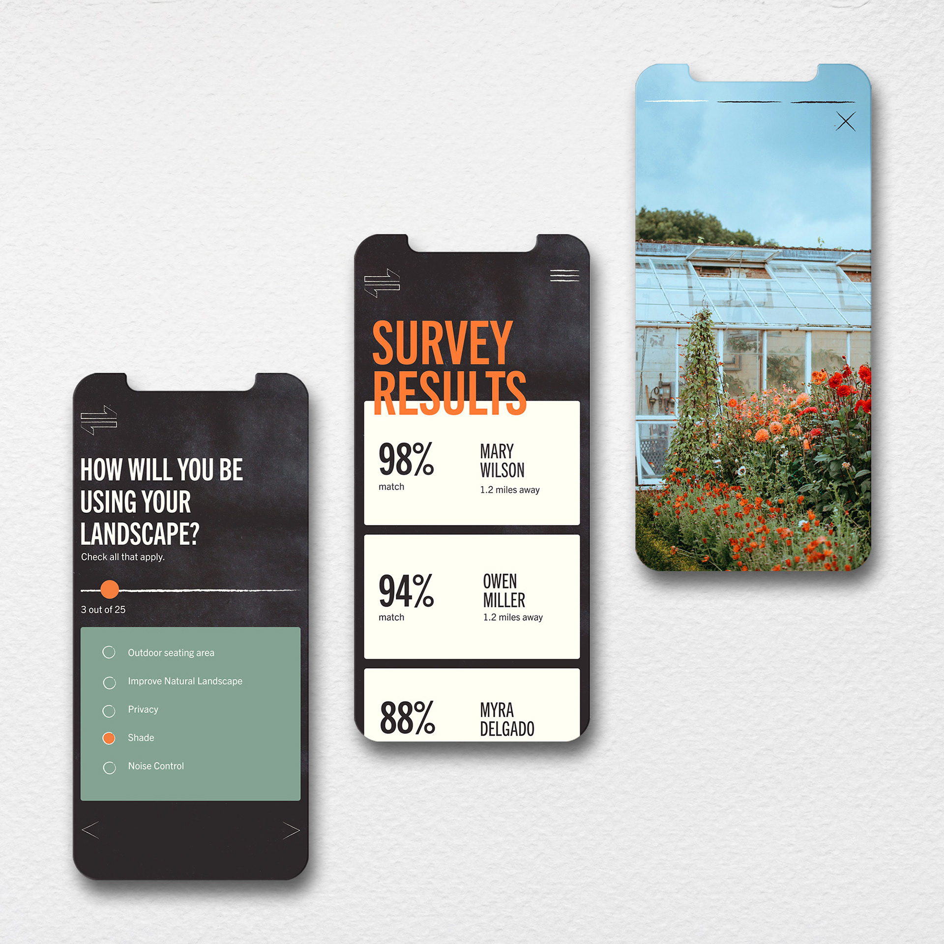
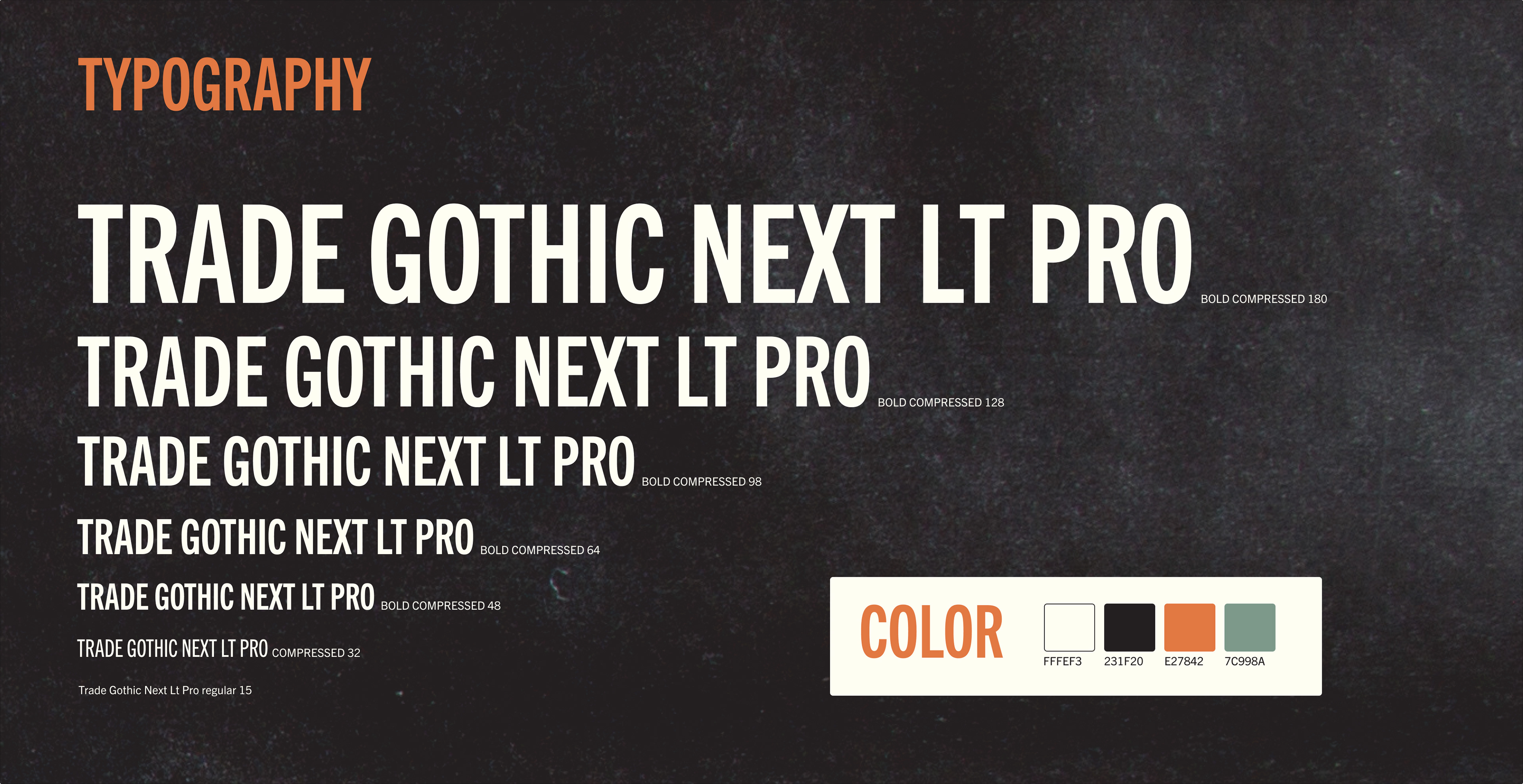
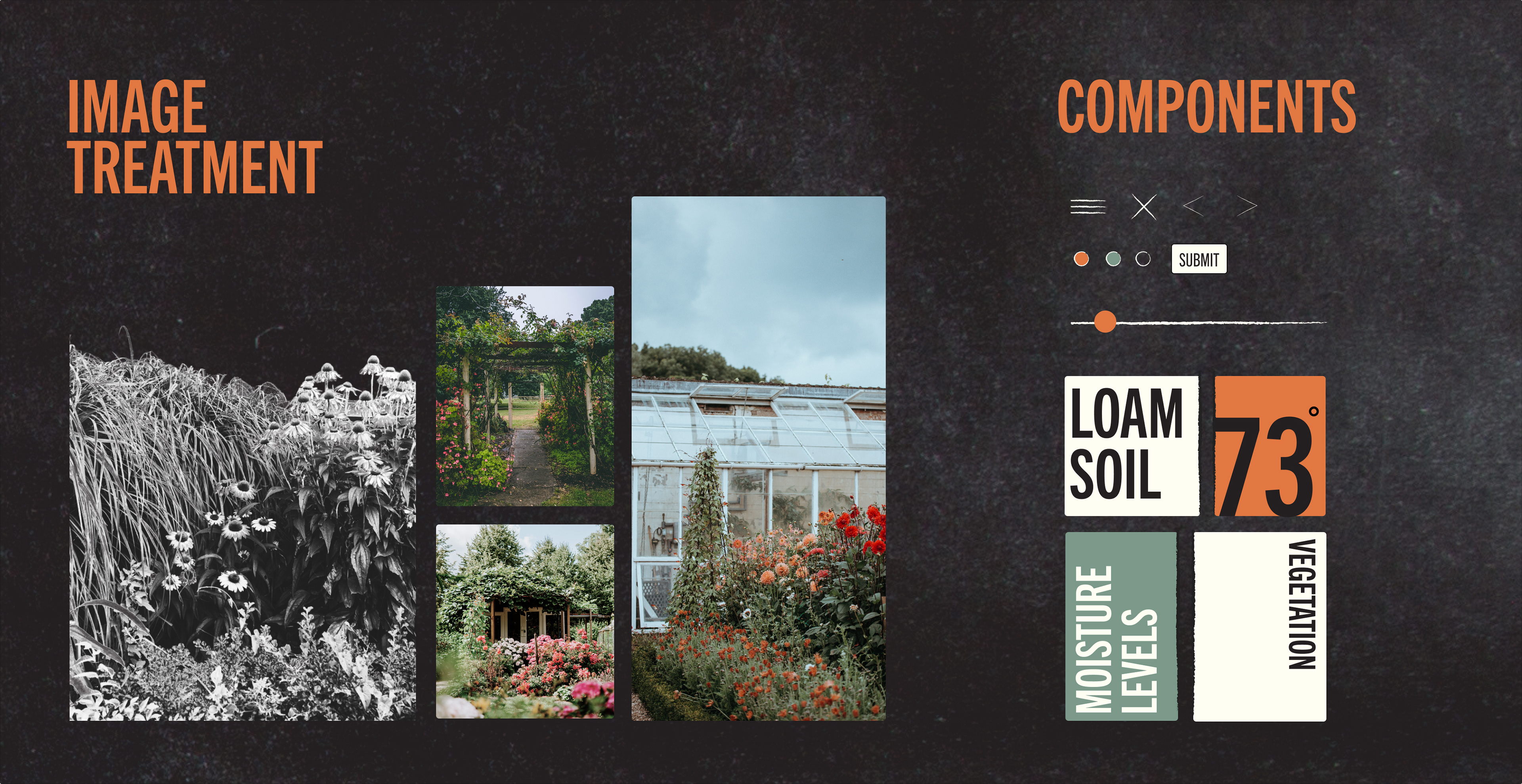
To enhance the visual appeal of the app, a color scheme consisting of ivory and grayish black was chosen to create a striking contrast between screens. This was complemented by accents of orange and teal, which adds a pop of color and sets it apart from other landscape apps that often rely on greens and browns. To reflect the designs commonly seen in landscape design blueprints, structural fonts were carefully selected. In addition to color and typography, the app also makes use of photography, sketchy icons, and texture to enhance the editorial feel. Bold type is strategically overlapped onto certain images to create added visual interest and a sense of depth.
ART DIRECTION: COURTNEY SPENCER

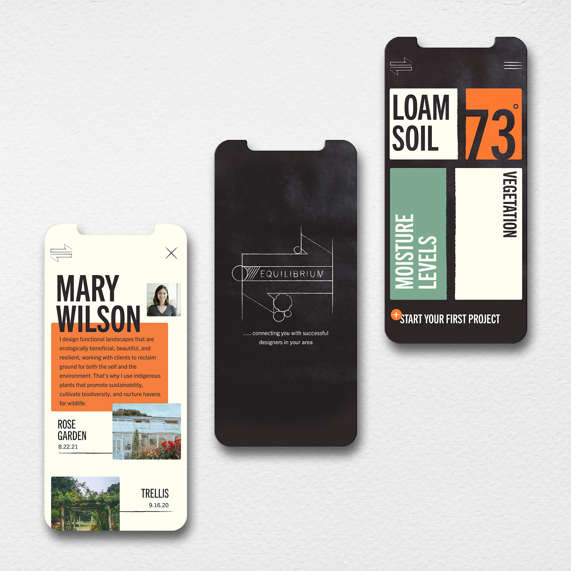
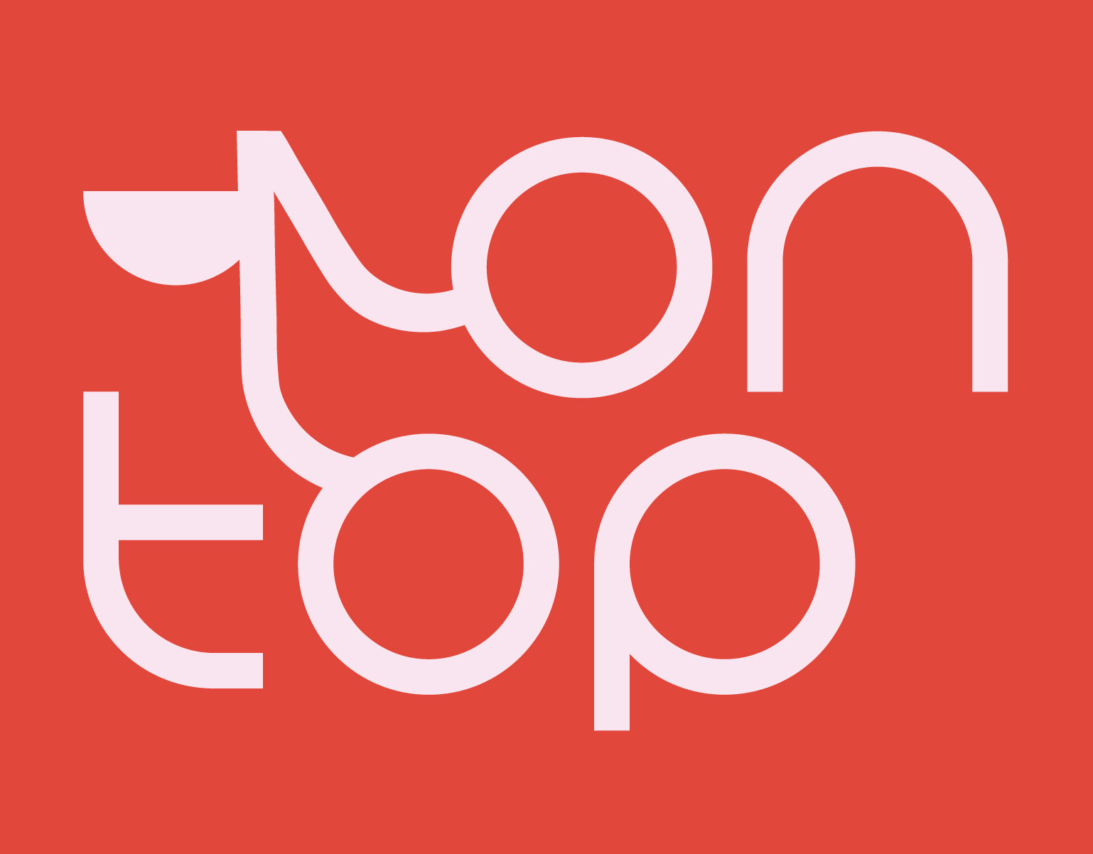
The logo incorporates the equilibrium symbol and elements of a landscape design blueprint. I chose the name "Equilibrium" for my app as it represents the pursuit of balance and harmony between designers and clients, as well as harmony within nature.

VIEW FULL CASE STUDY